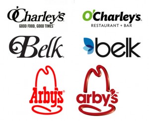
It seems like everywhere I look, corporations are rebranding, and inevitably, their logos include sans serif fonts. Sans serif looks undeniably modern, and I guess that's why they are rushing to switch. Sans serif is trendy - it's "in". A while back Belk made the dive with good results, in my opinion; the new logo matches well with their attempt to shed their reputation as a place for Southern grandmothers to shop for clothing. However, I'm just not sure that sans serif has a place for every logo out there, depending on a business's core services and identity.
 Recently, Arby's and O'Charley's have jumped on the sans serif bandwagon, I've noticed during my latest excursions for fast food roast beef sandwiches and cheesy potato soup, respectively. Both of these restaurants have changed ownership in the past few years, so such renovations are not surprising.
I was bewildered by the DVD-looking apostrophe in the new Arby's logo, but after a quick search, I discovered it is supposed to represent a meat slicer. Arby's is pushing the "fresh sandwich" angle, bragging that they slice their meats in-store, and envisioning themselves as a competitor to places like Subway. Maybe the meat slicer apostrophe was a good idea for conveying this new marketing approach, but since I (and everybody I asked) could not even recognize it as a slicer, it failed. The sans serif font does not work for me either, as the restaurant's special identity has been lost; the old Western-style font, while admittedly gaudy, did a much better job of conveying the brand's southwestern, roast beef, curly fry goodness. The cowboy hat has been retained, but it is glaringly at odds with the new text.
I feel similarly about the new O'Charley's logo, which is extraordinarily generic. While the old logo may have had its issues, it had personality. "I have no idea what O'Charley's is. Never heard of them, never seen the logos," one person wrote. "My totally unbiased opinion is that the older logo conveys the sense of an old timey pub, with home-cooked style food. The new logo creates a sleek, modern emotion, and I envision them having trendy cafe fare. Old = Steak and a bowl of soup. New = Mediterranean salad with chopped walnuts and whatever the hell aioli is." Those familiar with O'Charley's will know that the "Old" designation is spot-on for the chain's food, the highlight of which are its soups.
Just like Dead Space 3 is turning into a pure action/adventure game to appeal to more people, and NOS Zero sacrificed taste and kick to appeal to more people, these logo re-designs represent another way corporations are attempting to lure in a wider customer base by becoming as generic as possible. Corporations should be reminded that they don't HAVE to use sans serif in logo redesign efforts; just because everybody else is doing it, doesn't make it a good idea.
Great take down of the new Arby's logo: The New Arby's Logo: Better or Boring?
Discussion on the O'Charley's switch: Under Consideration


